This page aims to cover the basics of color science related to computer and video game display systems. Much detail is left out on purpose to keep content relevant, however links are provided for further reading.
This page is currently work in progress, and this note will be removed when it is ready for public consumption.
Visible Light
Electromagnetic radiation (EMR) can be measured by its frequency or wavelength. Common EMR we might be familiar with include the "microwave" range that certain WiFi bands operate at, with a frequency of around 2.4GHz and a wavelength of around 12.5cm. Light that can be seen by the human eye is also a type of EMR, and ranges from approximately 380nm (nanometers) or 790THz (TeraHertz) which we perceive as a deep violet, all the way through to 750nm or 400THz which we perceive as a deep red.
Plotting these color values against their wavelengths, we see the visible light spectrum:
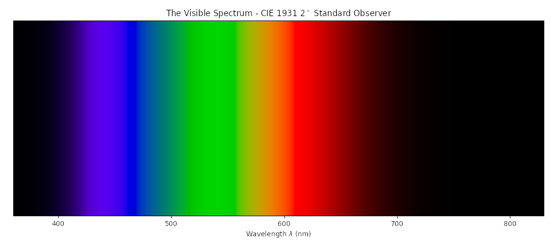
Note that this spectrum does not contain colors that we refer to as "pink" or "magenta", nor does it contain what we call "white". This will be explained later.
Human color vision
Human eyes contain light sensitive photoreceptor cells that are activated by the presence of specific electromagnetic radiation. With respect to color vision, two of these cell types play a vital part:
- Rods, which are stimulated by approximately 498nm (somewhere between cyan and green), and affect our perception of "lightness"
- Cones, three of which are stimulated by:
- 420nm, which we see as Blue, and refer to as "Short" wavelengths
- 534nm, which we see as Green, and refer to as "Medium" wavelengths
- 564nm, which we see as Red, and refer to as "Long" wavelengths
Interactions between all four of these photoreceptor cell types then create our perception of color. Because humans have three color receptors specifically, we are referred to as "trichromats" (and our vision described as "trichromatic").
Further reading on human trichromatic color vision can be found here:
If we were to take our visible light color spectrum from above, and bend it at our "Medium" wavelength point, we create the CIE 1931 Chromaticity Diagram:
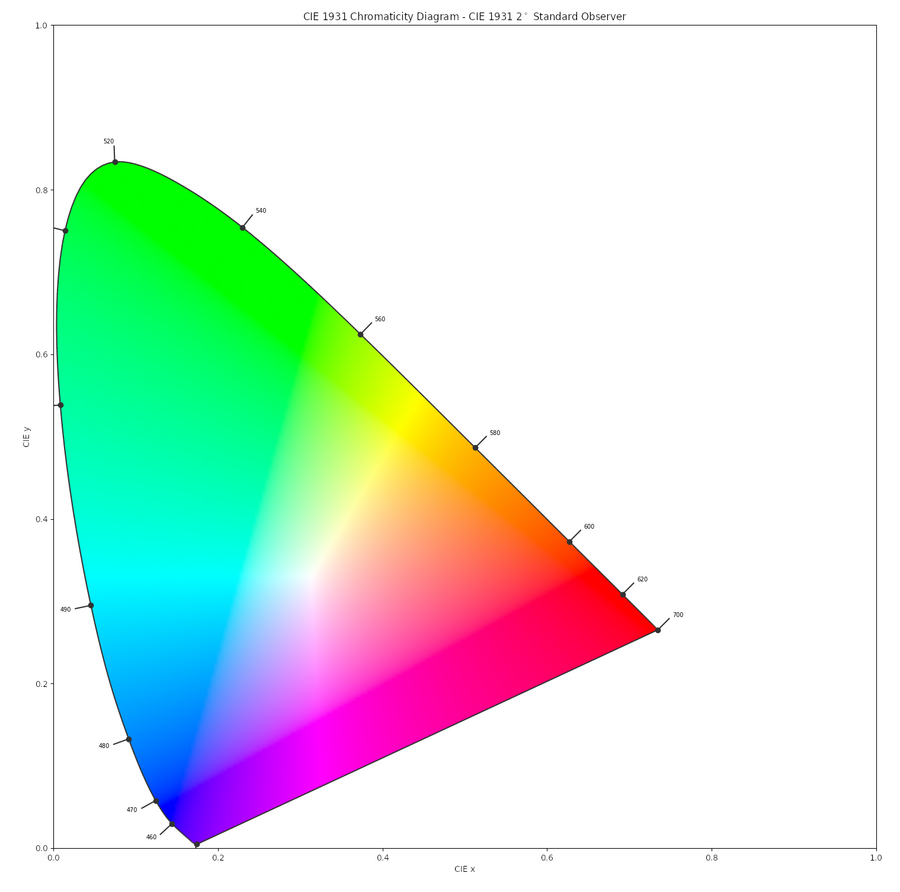
This gives us a rough idea of how interactions between the Short/Medium/Long wavelengths (which we see as Blue, Green and Red respectively) and how we then perceive these interactions. For example, wavelengths that we perceive as "Yellow" in the 565nm to 590nm wavelength range would partially stimulate both our Medium and Long sensitivity cones.
Special cases exist where multiple wavelengths of light hit our eyes at the same time. For example, if "Blue" and "Red" wavelengths both hit our eyes simultaneously and activated both the Short and Long cones, we perceive this as shades of "Pink" or "Magenta" - colors that don't exist as a single wavelength. When all three cones are activated at once by Short, Medium and Long wavelength light (or alternatively two wavelengths that activate multiple cones each, like Yellow or Cyan), we perceive these colors as drifting towards the grayscale (and at the brightest point of that grayscale, White light).
This diagram is three dimensional, however we generally represent it flat 2D shape for simplicity. But you can imagine the image going into the screen towards black, and coming out of the screen towards white, with darker and lighter shades of all colors within the three dimensional shape.
Further reading on the CIE 1931 color space can be found here:
Color Models
Not to be confused with colour spaces. Color models use different principles of light reflection, light absorption, and wavelength perception to represent colors as mathematical combinations of "primary" colors. Two common color models are:
- RGB - this is an additive color model, commonly used with generated light. i.e.: colors are added together and get "lighter", with primary colors adding together to create secondary colors:
- Red + Blue = Magenta
- Red + Green = Yellow
- Green + Blue = Cyan
- And finally all three colors combining to create white.
- CMYK - this is a subtractive color model, commonly used in paints, dyes and prints where colors are reflected. As colors are added together, they get "darker", with primary colors adding together to created secondary colors:
- Cyan + Magenta = Blue
- Cyan + Yellow = Green
- Magenta + Yellow = Red
- And finally all three colors combining to create black.
"CMYK" has an extra "K", referring to blacK (with "B" used for "Blue"), which when printing inks produces a sharper and more efficient black print (as well as far less soggy paper) rather than three colors laid on top of each other.
In both additive and subtractive cases, varying levels of the three primary colors can generate a wider range of shades in between the pure primary and secondary colors, such as the human skin tone range which despite its apparent variance, all sit within a close group when measured on a vectorscope or when plotted on the CIE 1931 diagram.
All color models are "device dependent" - i.e.: they depend on the underlying capabilities of the display technology showing them. It's often incorrectly assumed that color models like "RGB" are absolute - e.g.: that in an 8-bit representation, "Green" is "R:0, G:255, B:0", and that represents "full green". However at time of writing in 2025, almost no device on Earth can show the shade of Green that exists at the extreme end of human color vision, and many different devices show radically different levels of certain colors. Likewise how any of the primaries R/G/B are defined varies greatly. Different CRTs used different phosphors for their primaries, meaning the values of "red", "green" and "blue" all differed. Displaying the same R/G/B value on two different displays could result in wildly different colours without other standards to provide a reference point. This is why two uncalibrated displays side by side showing a "white" R/G/B 255/255/255 image can look like completely different shades, colours and brightness levels.
As such we have to use a "color space" instead to limit what can be shown on a specific device (whether that's a TV screen or a printed page), or to compensate for the drift in primaries and output response of each display. We can calibrate displays to these colour spaces, and we can use mathematical models to accurately simulate one type of display on another. This will be covered in further sections.
White Point and Color Temperature
Using the additive RGB color model, "White" is a tertiary value where all three primary colors are mixed. However human vision is both physical (photoreceptor cells in the eyes being activated by specific wavelengths of light) as well as psychological.
Consider a situation where the color of something indicates that it could be dangerous (say, poisonous food, or a venomous animal). Under certain ambient lighting conditions (dark environments or at night time, the redder light near sunset, the bluer light of the midday sun) the false perception of those colors could be disastrous.
As such, humans have developed "color constancy" - a psychological adaptation to adjusting the perception of a given color based on things like the ambient light surrounding that color, or longer exposure to another color. You can do this experiment for yourself - take a piece of colored cellophane or other colored semi-transparent material, and place it over your eyes while you look at a well lit area. Continue doing this for a minute, then remove the cellophane. Your perception of the colors within that area will seem inverted - if the cellophane was blue, you'll perceive colors as more yellow/brown/red. If the cellophane was red, you'll perceive colors as more blue/cyan. Wait another minute or so, and your color perception will adjust back to normal.
Further reading on color constancy can be found here:
We also measure "White" light against daylight, yet daylight itself changes across the day, from "warmer" red tones of sunsent and sunrise to "cooler" blue tones of the midday sun.
As such, we measure "White" based on what's known as a "color temperature". These temperatures are based on the color of "black body radiation" - i.e.: the color that suns and stars in space emit at specific temperatures, measured in "Kelvin" (where 100 degrees C = 212 degrees F = 373 Kelvin). The surface of Earth's sun is approximately 5772K, giving it a "Yellow" appearance. When Earth's sun is in the midday position on an "average North American or European Day", as it scatters through our atmosphere and turns slightly bluer, this is measured at approximately 6500K (actual real world measurements will depend on much more, including time of year, cloud cover, etc). We refer to this approximate 6500K color temperature as "Standard Illuminant D65".
There exist a wide range of standard illuminants, and various color standards around the globe and across various times have differed on how they define their "White Point". The D65 standard (more recently corrected to 6504K due to accuracy adjustments to Planck's Constant) today stands as the White Point for most color standards. However there are many references to displays in Japan from the 1970s through to the 1990s that used "D93", or 9300K (later corrected to 9305K) as their White Point. This is often refuted by broadcast professionals, however it exists in several publications from engineering standards bodies such as SMPTE (USA), ITU (EU) and ARIB (Japan).
Somewhat confusingly, D65 is considered a "warmer" white point, and D93 is considered a "cooler" white point. This is because we consider redder colors to be "warm", and bluer colors to be "cool", despite the opposite in reality (where 6500K is much colder than 9300K).
Further reading on Standard Illuminants can be found here:
Display technology
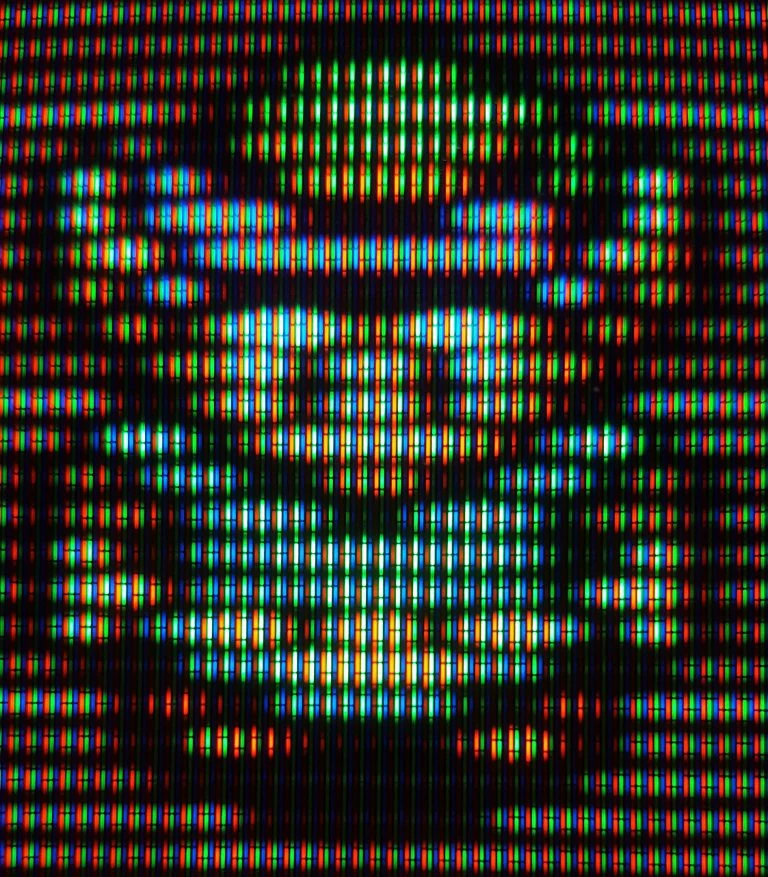
Given that most humans are trichromatic, with photoreceptors activated by wavelengths we refer to as Red, Green and Blue, it makes sense to build display technology using similar concepts. Most screens, whether they be CRT, Plasma, LCD or OLED, use the additive RGB color model to generate a wide range of colors. If we zoom in closely on a CRT display, we can see the three different colored phosphors that light up when hit by their respective electron guns:
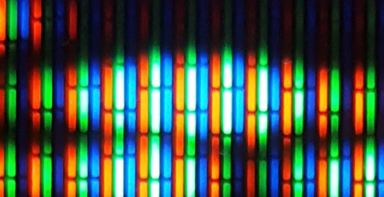
We can zoom in further again, and see the individual Red, Green and Blue phosphors clearly:
Similar principles drive the pixels in modern high res displays, whether they generate light directly (such as CRTs, Plasmas or OLEDs), or push white light through a colored filter (such as LCD displays with generally either white fluorescent or LED backlighting).
Gamma, OETF and EOTF
Human perception of light is non-linear. We have a natural ability to tell the difference between darker and lighter areas of an environment (i.e.: higher contrast) than we do areas of equal lightness. Similarly, CRT displays produce light output in a non-linear way, where the doubling of the power of the electron gun exciting the screen phosphors does not produce double the light energy displayed from the screen.
We describe the process of the relationship between an original scene, the encoding into a digital or electrical signal, and then back out again from a display as "transfer functions". Encoding from the real world scene ("Optical") to a digital representation ("Electronic") is described as the OETF (Opto-Electronic Transfer Function). Then decoding from digital signal to screen output as the EOTF (Electrol-Optical Transfer Function). The full path from scene to display is referred to as OOTF (Opto-optical transfer function).
To take advantage of the patterns of both the human visual system and the natural tendencies of CRTs, the brightness portion of images and video signals were often encoded as a simple "gamma function", or simply "gamma". Although in practice both the OETF and EOTF of certain colour spaces included a linear portion near black. For example, sRGB (the standard for SDR PC displays), BT.601 (a more recent standard for standard definition television) and BT.709 (a common standard for high definition television) all have both an OETF and EOTF of approximately 2.2, which is why it is sometimes referred to as "gamma 2.2". However the exact specifications require a linear encode and decode for values under a linear intensity of around 0.3%. In practice the impact of applying a simple gamma 2.2 can result in black levels that appear too high ("raised blacks") or too low ("crushed blacks"), although these errors can also occur in the incorrect mapping of limited and full range RGB, so identifying the culprit can be tricky.
Modifications to EOTFs have been made on modern displays to compensate for brighter viewing environments. It is common for domestic HD TV users to choose a gamma closer to 2.4 to provide a more pleasing contrast to images in brighter viewing environments. Displaying content with a native 2.2 gamma on a screen with 2.4 gamma would make the image look like it had a slightly higher contrast, and push the brighter regions to give more light output without raising the darker regions as far.
And important value to find for both capturing and emitting video signals is "middle grey", or the point at which lightness appears to be at 50% perceptually. At a gamma value of 2.2, middle grey is around 22% linear lightness. At gamma 2.4 middle grey is around 19% lightness. Photographers will use a "grey card" to calibrate the white point of their cameras, which is set at a middle grey value of 18% (roughly gamma 2.47).
Confusingly, some displays simply list their default gamma as "0", and offer a scale of +/- some integer number. This can be thought of as "0" being gamma 2.2, and "+1" or "-1" changing the gamma by 0.1 in either direction.
Modern HDR transfer functions differ quite a lot. The two most popular standards are HLG (Hybrid Log Gamma), co-developed by the BBC and NHK and designed to be backwards compatible with SDR gamma. While useful for certain circumstances like broadcast video where it was simpler to send a single format that could still be interpreted by older devices, HLG is less efficient than the dominant HDR transfer function named PQ (Perceptual Quantizer). PQ was developed by Dolby and standardised by SMPTE (The Society of Picture and Television Engineers) in 2014 as SMPTE ST 2084, and by the ITU (International Telecommunication Union) in 2016 as the transfer function for BT.2100 (as well as one of the transfer functions supported by BT.2020). PQ allows for much more efficient encoding, being able to produce an image with no visible banding to the human eye at 12 bits per channel (versus power law functions like gamma and HLG requiring 15 bits to achieve the same visual quality).
Color Spaces
Not to be confused with colour models. Color spaces define not only how colors combine (similar to a color model), but also what the absolute values of primary colors are. This is necessary so that displays accurately show the same values, shades, hues, saturations, lightness, darkness and white points of a given range of colors.
Some common color spaces that we use in both color science as well as display devices attached to video game consoles and computers are:
CIE XYZ - A normalised version of the entire range of human color vision, which serves as a convenient mathematical model to base most color math on. It ranges from 0 to 1 (with no points in the negative) and covers the entire human visible range. Each of the color spaces below will define the position of their primaries and white points on this CIE XYZ chart, which will be represented by a triangle (each corner being a primary color), and a dot in the middle (being the white point). CIE XYZ is rarely used to define image encoding or human chromatic sensitivities, but rather as a mathematical constant when converting from one colour space to another, or when describing the absolute chromatic characteristics of a display independent of lightness (i.e.: the absolute colour co-ordinates/values of the red, green and blue phosphors, crystals, organic or inorganic LEDs, etc of a display panel or CRT).
ITU-R BT.601 (aka "Rec.601") - the digital equivalent of the analogue ITU-R BT.470. This was the color space for later "standard definition" video content, and came in two forms that had minor differences, one for "525 line" (NTSC/480i/240p) modes, and one for "625" (PAL/576i/288p) modes to compensate for both the resolution perception differences as well as timings associated with each standard. This is commonly the standard used in DVD media.
sRGB - defined by HP and Microsoft in the 90s as a standard for computer monitors. It was very slightly different to the BT.601 standards to compensate for the higher line counts and brighter office viewing conditions.
ITU-R BT.709 (aka "Rec.709") - the color space for "high definition" video content in SDR (Standard Dynamic Range), from 720i up to 1080p. This standard intentionally chose the same primary color points as sRGB to make converting between computer and television standards simpler. This is the standard used by almost all HD TVs and UHD/4K TVs when in SDR mode, as well as Blu-Ray (HD/1080p) media.
ITU-R BT.2020 - technically able to be both SDR and HDR (High Dynamic Range), we often associate this color space with HDR modes. More notably BT.2020 utilises what is called a WCG (Wide Color Gamut) to be able to display far more colors than previous BT.601 / BT.709 standards. With so many software tools and video systems lazily assuming everything is one of the nearly identical BT.601/BT.709/sRGB for so long, we see errors here where colors look either too over-saturated or very washed out, as the primary colors of one standard are incorrectly mapped to the primaries of another. BT.2100 is the next standard along, and is identical to BT.2020 in HDR mode (BT.2100 has no provision for SDR). BT.2020 is the standard for most UHD/4K TVs in HDR mode, and increasingly more and more video games in HDR mode. It is also the standard used in "4K Ultra HD Blu-Ray" media.
DCI-P3 - the color space used in digital film. It has a wider color gamut than BT.601/BT.709/sRGB, but not quite as wide as BT.2020. Notably different to all the previously mentioned standards by having a 6300K white point (non-planckian locus, and slightly greener than the D65 standard). This is due to the use of xenon-arc lamps in theater projectors of the time.
Display-P3 - a modified version of DCI-P3 with the white point set at the standard D65. At time of writing in 2025, this is a very common color space used by many Apple and Android phones (particularly those with HDR capable OLED screens).
CIE Lab - a "device-independent" colour space, different from the above in that it does not reference a display device. Instead it references the "CIE standard observer" - a model of average human chromatic response and colour perception. It splits the co-ordinates into "L" - or lightness, and a/b, which represent the human response to red/green shifts on one axis, and blue/yellow shifts on the other. This colour space is designed to be more intuitive to users and artists when attempting to perform simple colour operations such as changing the lightness of a colour without changing the hue (or the opposite), which are too difficult to do in various RGB based models (where uniform changes to R/G/B channels don't result in uniform changes to lightness or hue).
HSV - Similar to CIE Lab, this is a "device-independent" colour space designed for the CEI standard observer model, but changes the 3D plane mode for a cylindrical model. The "H" portion are hues are represented by a colour wheel in a circle. "S" is a linear saturation (how intense a colour is moving away from grey). "V" is the value, or lightness/brightness. Like CIE Lab, this is designed to be a more intuitive colourspace for artists and end users to choose or modify colours.
Oklab / OkLCH - like CIE Lab and HSV, this is a "device-independent" colour space. However they greatly improves on perceptual uniformity (i.e.: human-perceived uniform changes in lightness and hue along moving along the colour space, either linearly in the Oklab 3D cube representation, or cylindrically in the OkLCH representation) without greatly increasing the mathematical complexity of the model.
TBD - gamut graphs of all of the above
Color Calibration and Correction
Colour calibration requires at least cursory background knowledge of what is described in this document. Calibrating a display for colour requires calibrating it against a known standard or target. Generally speaking the goal for calibration is typically one of the following for each display type (noting that these are merely suggestions, not hard rules or even followed standards in many historical cases):
- Standard Definition CRT television:
- BT.601-525 for NTSC 480i/240p, BT.601-625 for PAL 576i/288p.
- Display EOTFs are typically gamma 2.2, although some PVMs natively behaved closer to 2.3
- US and EU white point: D65
- Japanese white point: D93
- High Definition televisions (including LCD, Plasma and OLED for content in 720i, 720p, 1080i and 1080p)
- BT.709 for colour with BT.1886 EOTF ("gamma"). Noting that BT.1886 had two modes, one for modern digital content, and one for emulating legacy SDR CRT content. In practice these were quite similar.
- Almost all content by this stage was beginning to standardise to D65, although some earlier Japanese content was still D93
- Ultra High Definition televisions (aka "4K" TVs)
- BT.709+BT.1886 for SDR
- BT.2020+PQ for HDR.
- Universally D65
- Computer displays
- PCs were almost entirely sRGB with D65 white point
- Some early Apple displays such as the "AppleColor RGB Monitor" used AppleRGB with a gamma of 1.8. By the iMac/Powermac era, Apple switched to standard sRGB style displays.
White points are an even more subjective topic. D65 has been quite standard across both the US and EU for all content, whereas Japanese content was frequently designed for D93 displays and output. Calibrating CRT displays to this white point specifically for Japanese content can be more visually consistent and pleasing, however also means that calibrating back to D65 can be frustrating when needing to watch mixed content on a single display.
Devices like the RetroTink4K and Morph 4K have comprehensive colour matrix correction systems built in, and can simulate D93 on D65 displays. This can make playing mixed D65 and D93 content on a single HD or UHD/4K display more convenient than manually needing to switch modes on the display itself. Depending on the scaler device and display, setting the device to HDR mode can still accurately map SDR content into the HDR container, and offer headroom for white points and colour spaces that fall outside of the BT.709/D65 range to avoid colour clipping.
For an in-depth guide on calibrating a CRT display, see the section CRT_Color_Calibration_Guide
Calibrating modern LCD, Plasma and OLED displays use identical methods to the above for SDR modes. For HDR modes, colorimeters that can measure WCG (Wide Colour Gamut) and HDR brightnesses are required, along with software and operating systems that can display the relevant HDR modes to generate the test patterns, as well as read and measure the results correctly.
Other links
- An article looking at the NES output signal voltage overdrive, and mapping that into HDR to simulate CRT phosphor overdrive using the RetroTink4K:
- Article talking about colour science and colour spaces in general, as well as unique CRT phosphors and D93 white points in Japan:
- News announcement of colour correction and D93 white points being added to the RetroTink4K
- D93 templates and files for the MiSTerFPGA and Gameboy Interface
- The PC Engine's native colour lookup table is successfully dumped:
- A deep dive into the PC Engine colour discoveries, and fixing emulators, FPGA systems and tools to match:
- Discovery of the Sega Master System's non-standard blue channel, and fixes in emulators and FPGA systems: